{{ ch.partTitle }}
{{ ch.partBlurb }}
{{ ch.partRange }} · {{ ch.partCount }}{{ ch.title }}
{{ ch.blurb }}
{{ ch.note }}
Matthew Osada
2026
I’m Matthew Osada, a sophomore at Syracuse University studying marketing in the Whitman School of Management and advertising in the Newhouse School of Communications.
At Syracuse, I’m a member of The Newhouse Agency, the nation’s largest student run advertising agency, and Pulp Marketing Club. At both, I’m learning how to work with a team to deliver high quality, effective projects for real businesses.
Outside of class, I run MBOGFX, a graphic design business I started at 15 that has now served 350+ clients and created branding for organizations like Southside Hoops and official PUMA circuit teams. Keeping up with a constant flow of design work on top of a dual-major course load has made me fast, organized, and extremely dependable on deadlines. Additionally, designing for an array of clients has taught me that good design not only looks nice, but makes people care about the brand behind it.
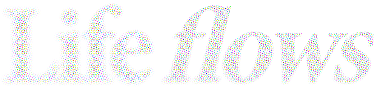
What I love most is bringing a vision to life. A good example is my unofficial American Red Cross concept campaign, “Life flows through us.” I led the strategy, creative direction, and design for the entire project, which you’ll find in this portfolio.
I’m looking for a summer internship in advertising and marketing where I can bring that mix of creative instinct and builder’s drive to a real team.
Selected work ↓
{{ featBlurb }}
{{ featMeta }}Matthew Osada
Unofficial concept2026


An unofficial campaign concept for the American Red Cross. Pairing with an existing clothing brand / artist, they would offer state-exclusive, limited edition tee shirts only obtainable by donating blood. They are numbered to the donor, with a tag that shows they gave blood.
Win over young people who have never donated blood. Make getting a shirt from a respected brand feel like a no-brainer.
 Photoshop
 InDesign
 Figma
 Claude Code
The Red Cross is warning of a national blood shortage. Summer 2026 donations hit a four-year low, and young donors have been declining since the pandemic. Yet Gen Z still shows up for causes, making up 42% of new Red Cross volunteers.
Streetwear has moved them to donate before. In 2022, ‘Drop for Drop’ partnered with NYC brand MONO, which resulted in 84% first-time donors by offering branded shirts for a pint of blood. The results are promising, but I felt the designs missed the mark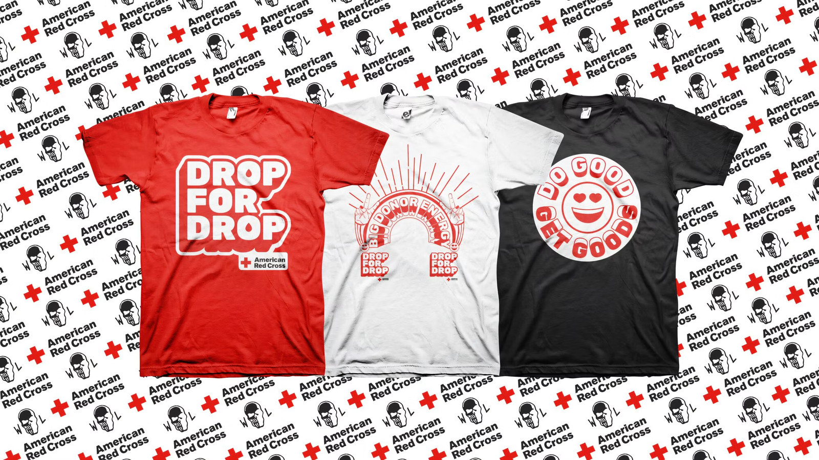 .
To test that, I showed 20 people aged 18 to 24 the Drop for Drop pieces, and three said they’d donate. Shown this concept without being told it was mine, fifteen said yes.
Sources: KBIA (Aug 2026), News3LV. Drop for Drop figures: MONO, agency-reported.
A true incentive is wanted before it’s explained.
By pairing with a brand young people already know, we can attract new donors with our limited-edition tees before they know the cause.
Potential collaborators are unofficial. Not affiliated with or endorsed by any brand shown.
Social Concepts: Social guidelines shown across three basic formats: an IG story, an influencer TikTok and a feed post.
Out Of Home Concepts: 2 poster designs, mocked up to how they’d be spread in real settings
In my experience, campaign/client work always arrives with the copy and the creative direction already written. This project I pushed myself to develop the messaging/insights front to back completely by myself. This was something challenging, yet extremely rewarding and I’m satisfied with the outcome.
I originally began this project with a lot of words, explanations and text. As I fleshed it out, I began to realize a good campaign should not require many words in order to get the point across. I feel I hit the mark in terms of making something cohesive, and self explanatory.
{{ ch.partBlurb }}
{{ ch.partRange }} · {{ ch.partCount }}{{ ch.blurb }}
{{ ch.note }}
{{ availability }}